
Lit
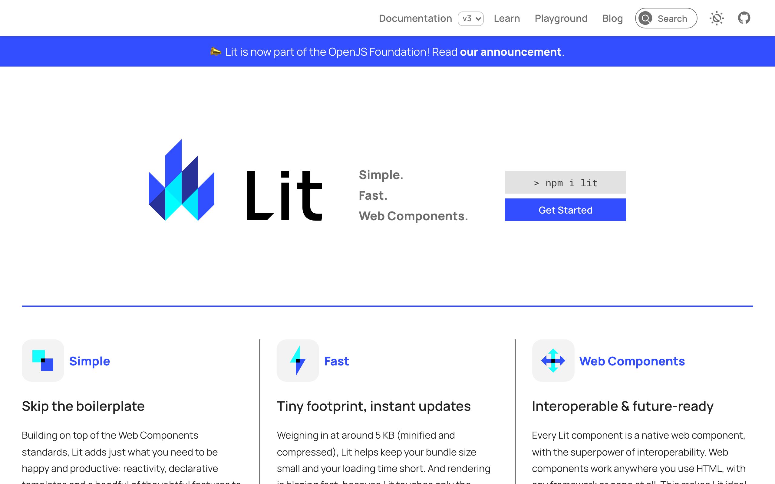
Lit is a simple and fast library built on top of Web Components standards that provides reactivity, declarative templates, and scoped styles via Shadow DOM to reduce boilerplate. Weighing around 5 KB, it renders efficiently by updating only dynamic parts of the UI without virtual DOM diffing. Components built with Lit are native custom elements that work across any framework or stack, making them ideal for design systems and shareable components.
Checked on Sep 30, 2026.
Alternative resources

MUI
Comprehensive suite of React UI tools and components implementing Material Design to ship user interfaces faster.

Grommet
A React-based component library focused on accessibility, modularity, and responsiveness for web applications.

React Bootstrap
A library of Bootstrap components rebuilt from scratch as native React components, removing the dependency on jQuery.